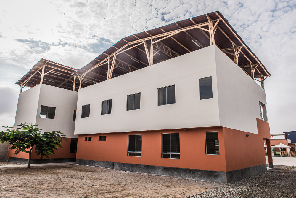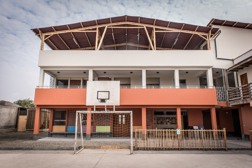
That’s right, folks. It’s the moment you’ve all been waiting for, the moment we’ve all been working towards for over a year now. I could ramble and make you wait even longer, but I think we’ve all waited enough already. And so, now I’m going to do my very best to give you a virtual tour of the completed school building! (Note: a big thank you to David Espinoza for taking these pictures!)

LOOK AT IT! (Ignore the fact that it’s orange and focus on the fact that it exists and is finished and that’s amazing!) This is the view from the “front”, as viewed from the soccer court (I say “front” because when you enter the property, you’ll see the other side of the building first because of how the property is set up… but this is the functional front of the building).
If it looks ginormous in this picture… well, that’s also how it looks in real life. The other buildings on the property are only two stories, so this one really does stand out.
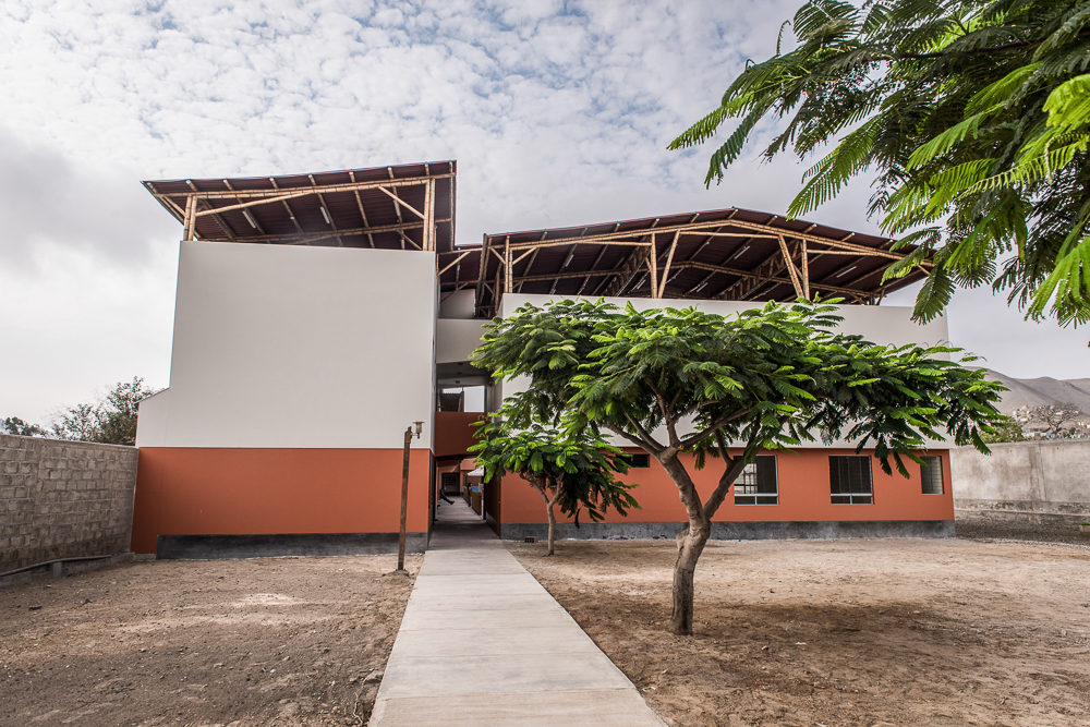
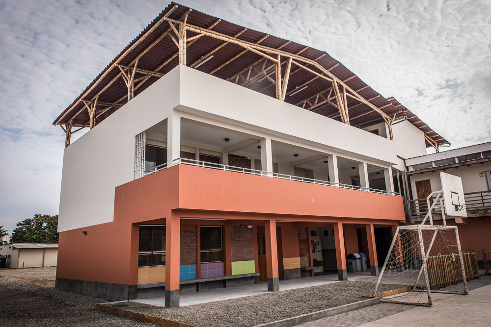
Back view. You can see the small side of the building better from this angle… there’s the big part with the gabled roof and the smaller part with just a single sloped roof surface.
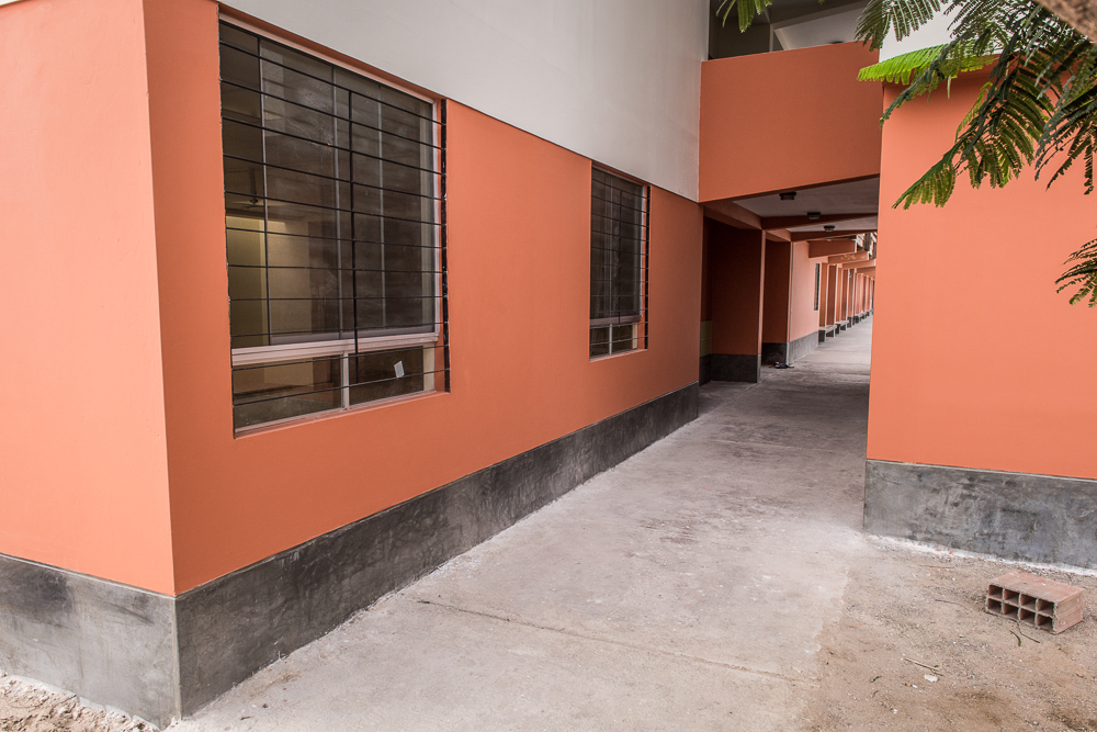
This is the first view of the building that you get when walking into the property. It’s not especially thrilling, but the side of the left building has no windows because the thought is that there will be more buildings along the left side of the sidewalk someday, as the school grows and needs more space.
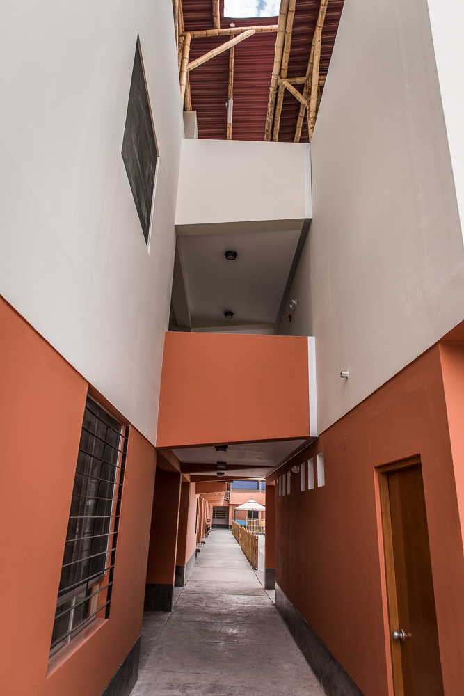
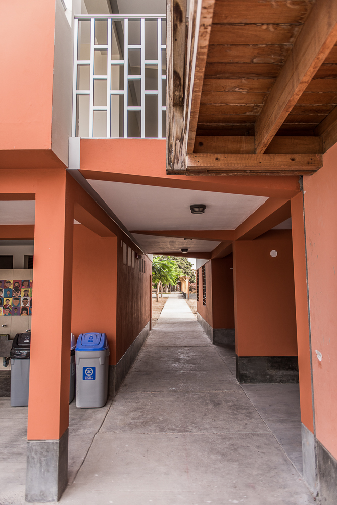
Approaching the building… Thanks to this “tunnel” and the walkway above, the two sides of the building can be accessed by a single staircase.
The building is actually designed as two separate structures. The left side and the walkways are one, and the right side is another. You can see the joint between the two really clearly in this picture, at the right side of the second-floor walkway.
Looking back through the tunnel towards the property entrance from the soccer court.
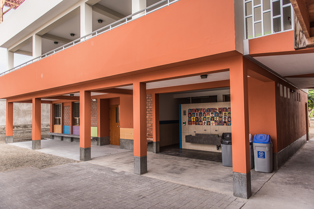
Do you remember how the building was constructed around an existing bathroom structure? That’s what you see on the right side of this picture, with the decorated tiles at the entrance. To the left of it, there’s a big, new classroom.
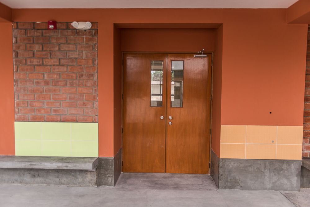
These are the doors into the classroom by the bathroom. Debbie had the doors custom-made, like many other things in the building. That may sound fancy and unnecessary, but there’s not the same selection of standard doors, windows, etc. as we have in the States.
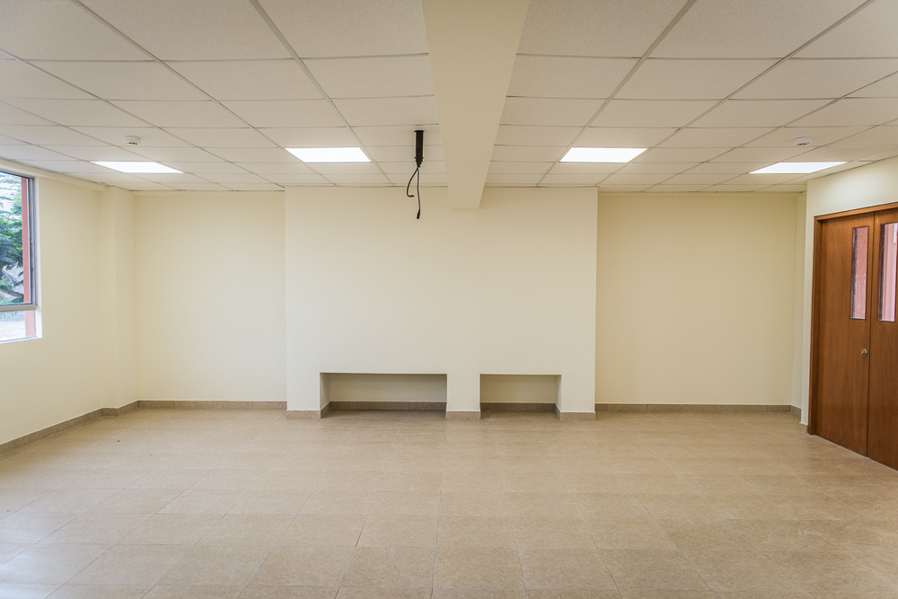
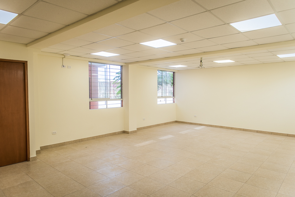
Inside the classroom! The mounting post for the projector is the thing sticking out of the middle of the ceiling (the thing that’s not a beam, I mean). I am so happy with how bright the rooms are, especially compared to the old classrooms! These lights are each more than twice as bright as the old fixtures, and their layout and design are far more efficient. The weird bump-out in the front wall is to create a flat surface for the whiteboard (with some storage space underneath, interrupted by a column).
Here’s the other first-floor classroom, located in the other “side” of the building, across the tunnel from the bathroom. Things really came together! You can see a smoke detector for the fire alarm system on the ceiling, and at the top of the wall between the door and first window, the internet system is connected!
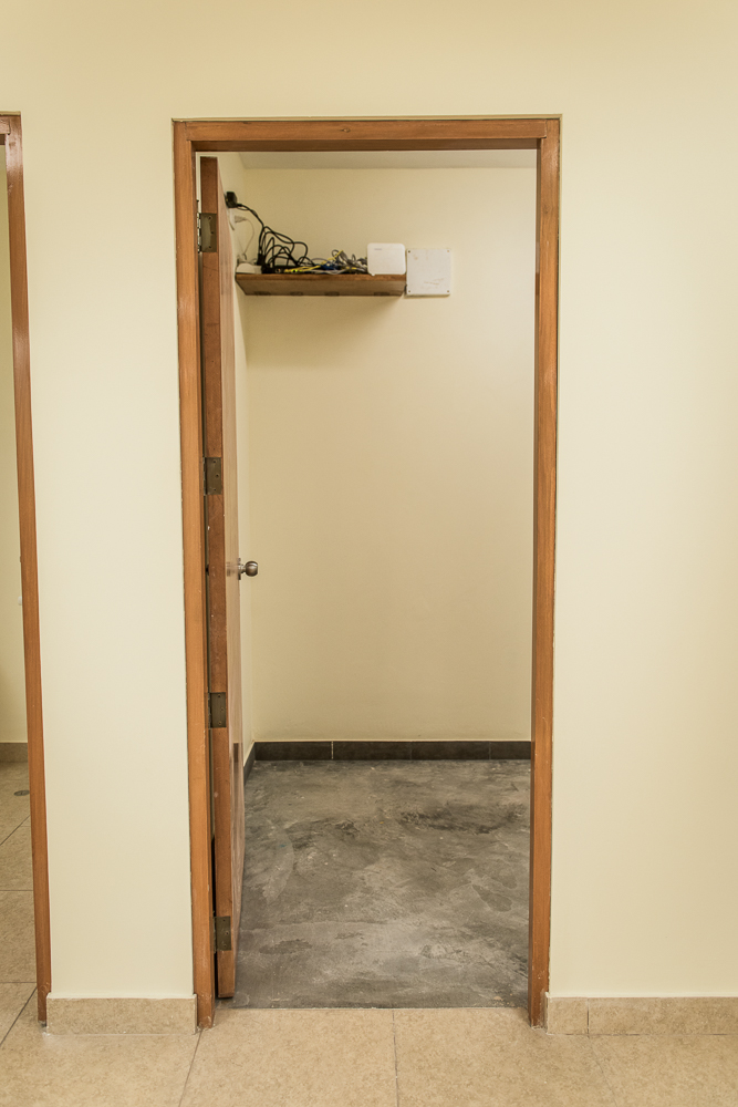
There are a lot of nice, big closets in this building! It may sound lame, but it’s very necessary. Schools have a lot of supplies to store! That mess you see on the shelf is the internet equipment. The internet cabling goes from this point to each of the classrooms.
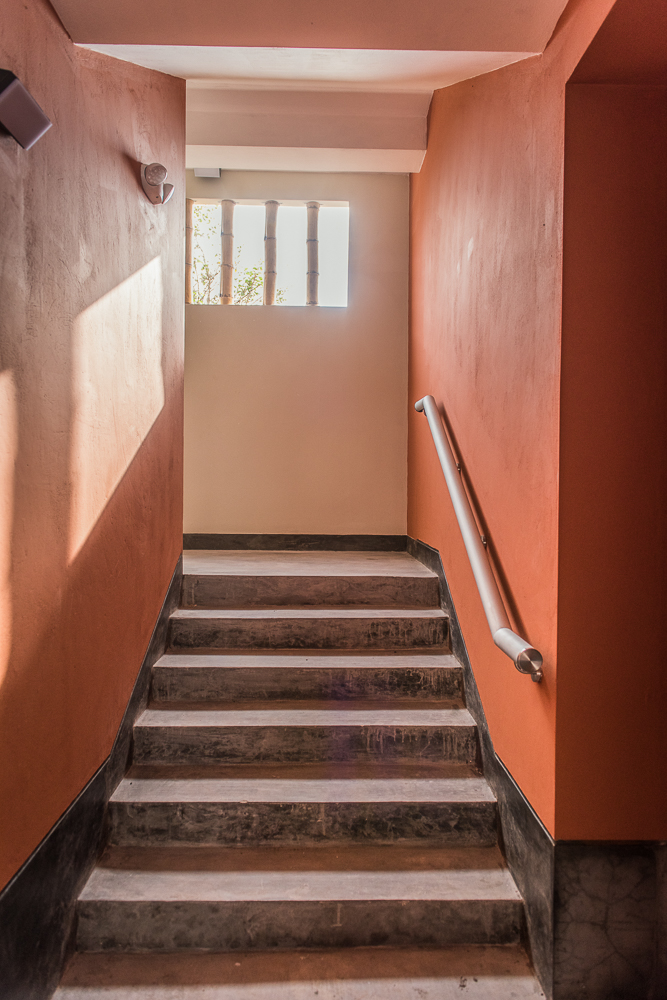
Staircase from the first floor to the second.
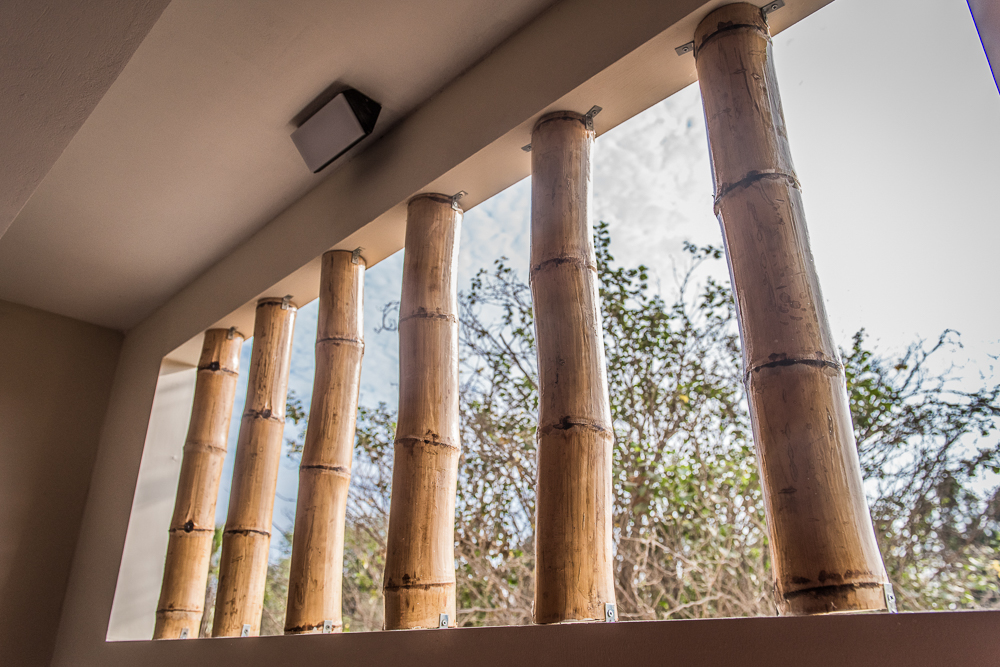
There are a bunch of cool bamboo details like this throughout the building. Also, admire that nice, sleek outdoor fixture that took us way too many hours to find.
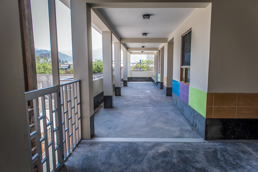
Second-floor hallway. This is the view from the staircase. You can see the joint between the two buildings in the walkway. Also, remember how worried you were that the transition between the brick structural wall and the cement board/drywall wall would be ugly? WELL, check it out! (The structural wall is the one facing us, with orange tiles on it. Around the corner, the green-tiled area is cement board (starting after the thickness of the brick wall). Seamless!
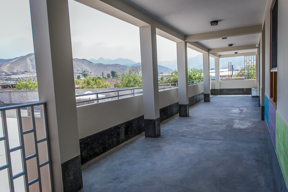
I do love that mountain view! Even if they are mostly brown mountains. The walkway is super wide, but the thought is that they’ll put low lockers/cubbies between the columns for the kids to store their stuff.
Now we’re all the way at the end of that long hallway. These are the windows outside of the classroom above the big first-floor classroom. Please, take a moment to appreciate these windows. This is really the only building on the campus that has windows on both sides and can (hopefully) get a cross-breeze going to keep the classrooms cool. These windows also slide open, unlike most of the existing windows which are louvered and the worst thing ever… If you’ve never seen windows like that, it’s similar to Venetian blinds. They have a bunch of long, narrow horizontal panes of glass that are either rotated open to let air in or closed. I suppose it works, but my gosh those windows are a PAIN to clean.
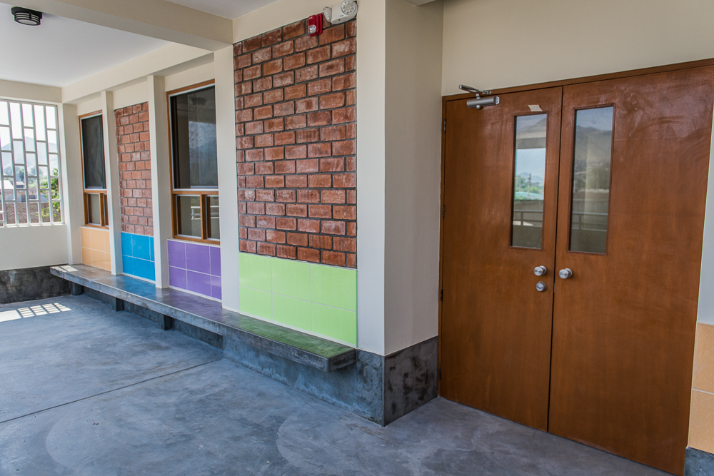
The entrance into that same classroom. The exposed brick is pretty cool, especially on this floor where the paint isn’t orange (bit of a color overload when there’s orange paint + exposed bricks + colored tiles).
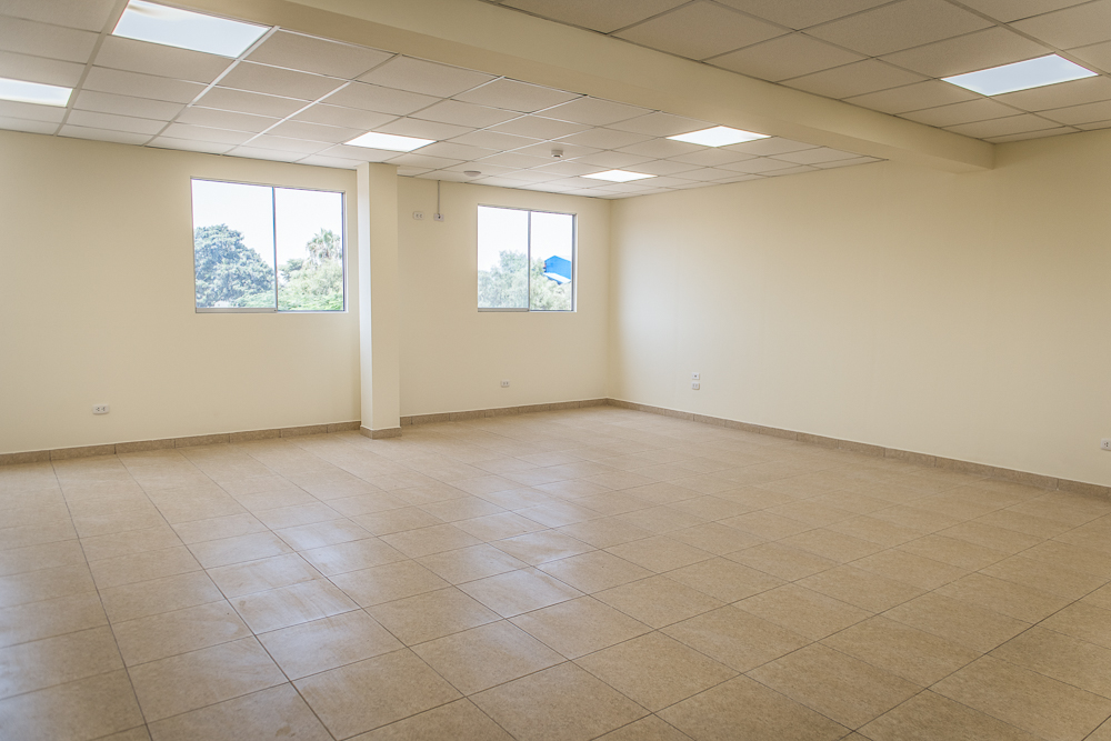
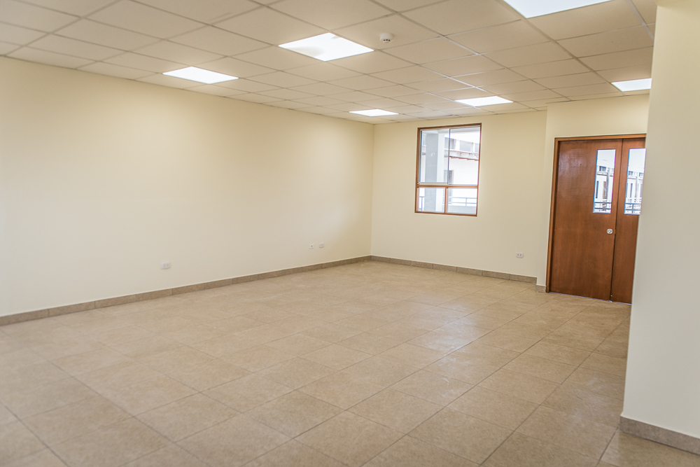
Inside. Check out all of that natural light! And the artificial lighting, of course. I’m just so happy with how they turned out. And we have acoustic ceiling tiles which I used to think were super boring but now appreciate for the acoustic marvel that they are. Without those ceiling tiles, every single surface in this room would be primarily reflecting sound, whereas the ceiling tiles help to absorb sound. As soon as multiple people are talking, that adds up to a very noisy room. Not good for learning!
This is the classroom next door, right above the bathrooms. It’s the most awkward one because of where the columns had to be placed (you can see one on the right side of the picture), but it’s still huge compared to the old rooms.
Okay, now we’ve left the above-the-bathroom classroom and have walked back towards the stairs. In this picture, the stairs are to our right, the other classrooms/hallway to our left. We’re standing on top of the tunnel.
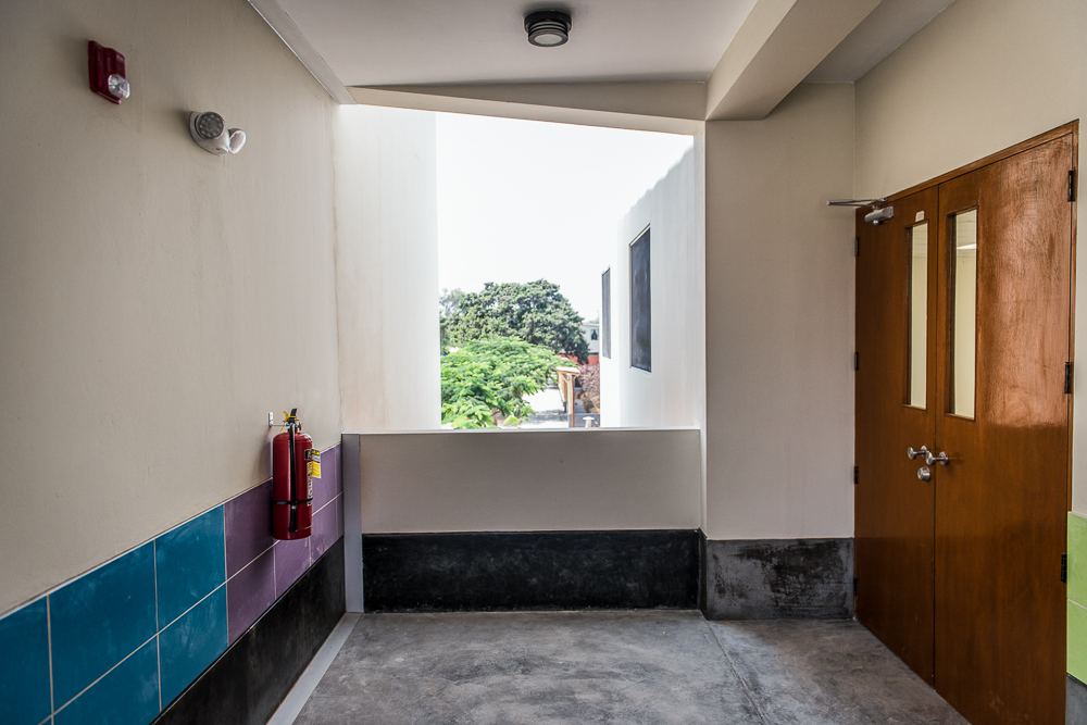
Here we also have all of those not-so-attractive-but-necessary building elements, like the fire extinguisher, emergency light, and siren/strobe for the fire alarm system. I’m just happy that the fire alarm system came together!
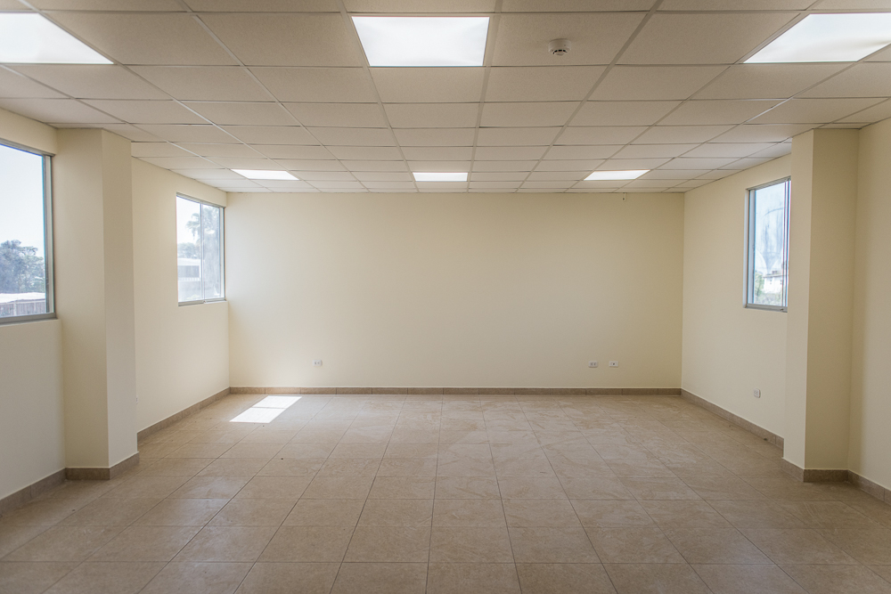
The final second-floor classroom (through the doors on the right in the previous picture).
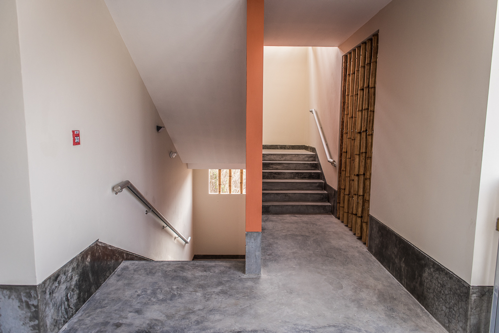
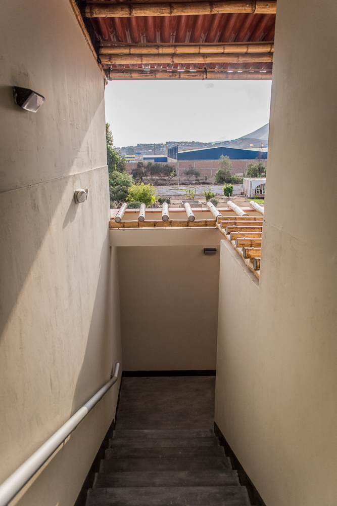
Staircase down to the first floor or up to the third.
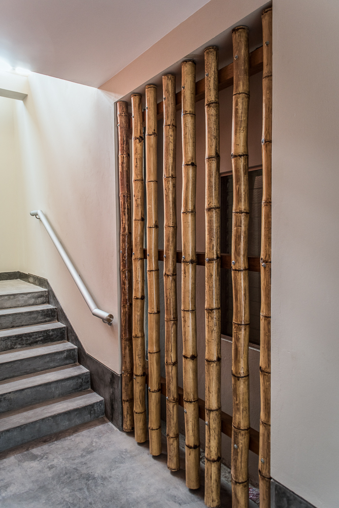
Here’s another bamboo screen. It may seem kind of weird, but it’s there because the old building has a window on the other side. Rather than closing it in permanently, they made it so that there can be some flexibility in the future. They could replace the window with a door and connect the two buildings, or something else. Who knows? But that’s exactly why there’s a bamboo wall instead of a concrete one.
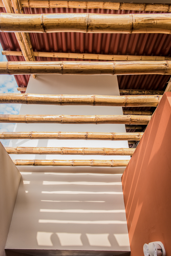
Going up the stairs to the third floor (standing on the landing and looking back the way you just walked). These bamboo pieces add some funky shadows!
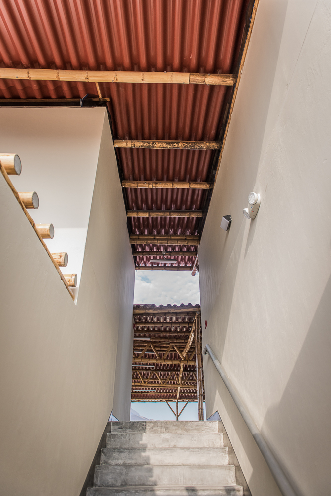
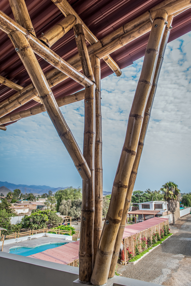
The rest of the way up to the third floor… with your first glimpses of the bamboo roof!
Looking back from the top of the stairs, here’s a better view of the bamboo above.
Another mountain view!
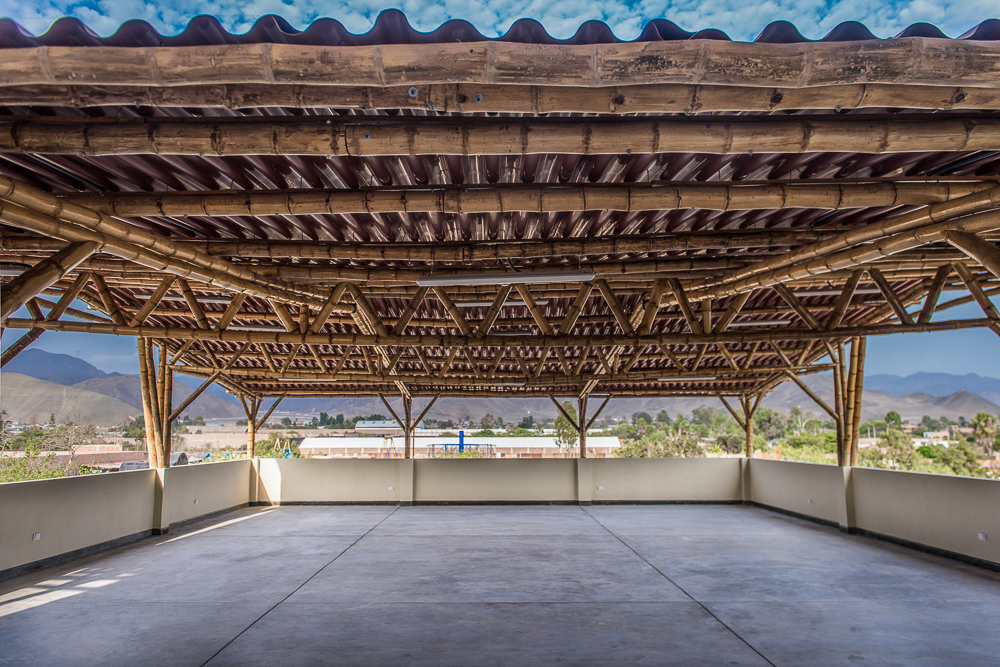
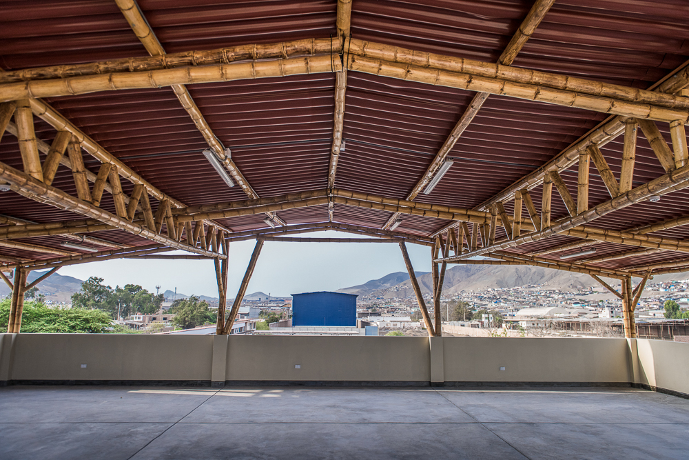
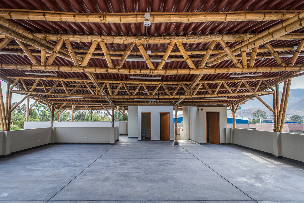
Check. Out. That. Roof.
This is a “multipurpose” space aka who knows what it will be used for but probably lots of things.
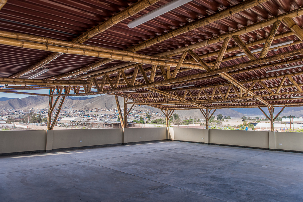
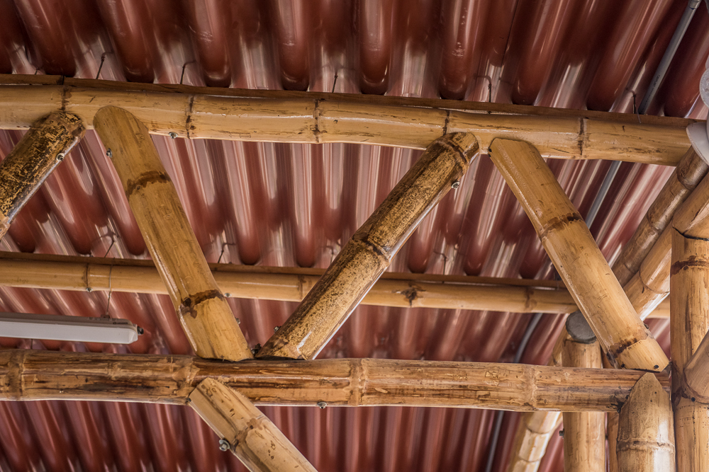
The big challenge for Debbie and the structural engineer was creating a design that would span the entire space without needing any columns in the middle. It took some creativity (and a couple of crazy trusses), but they did it! And it looks awesome, at least in my opinion.
You can see how the bamboo pieces were all custom cut to fit together snugly. Those trusses were a big job!
This gives a good view of the trusses, plus some of the light fixtures! And that gorgeous blue box in the background is the neighborhood quinoa factory (obviously).
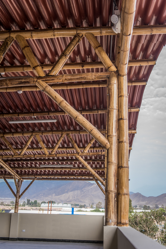
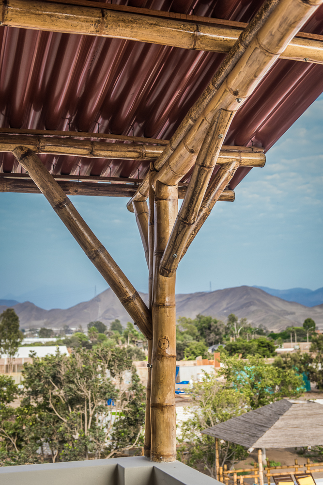
These columns are all crazy… #1
#2
#3
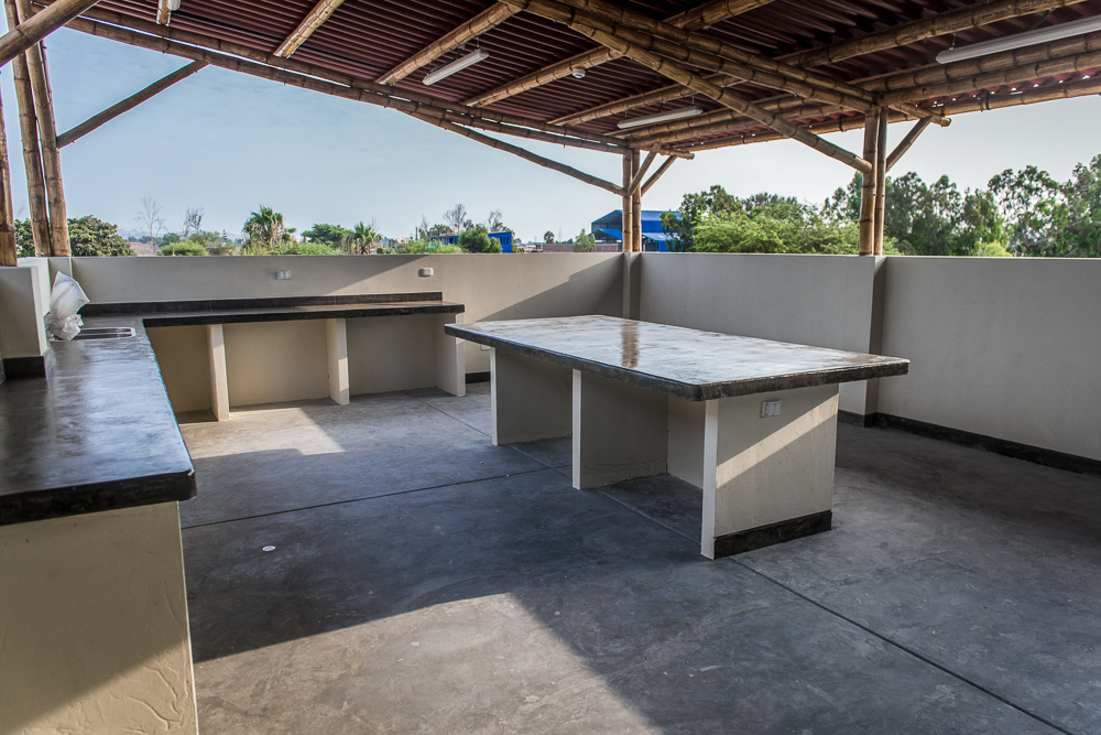
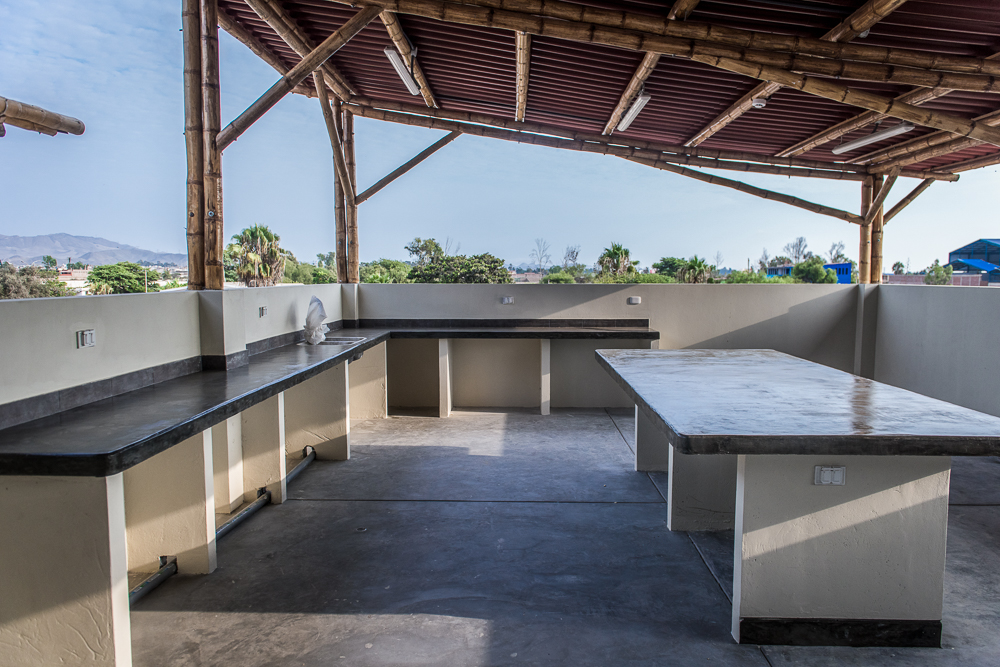
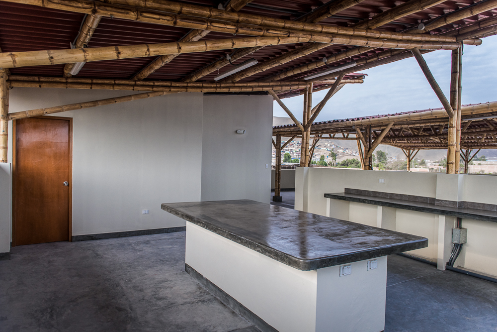
Looking back towards the stairs. In the back left is the kitchen/lab space, then there are two little bathrooms, the opening for the stairs, and a closet to store the plastic tables and chairs that they’ll someday use for multipurpose things.
And if you’re wondering what those pimples on the bamboo roof structure are, I’m afraid I’m responsible for all of them (this is why engineers and architects have problems… I know my stuff is ugly, but they don’t make invisible boxes yet). In the front, we have a smoke detector prominently featured, and then all of the lights have bright white junction boxes because that’s the only color they sell.
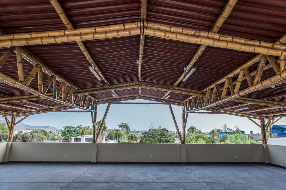
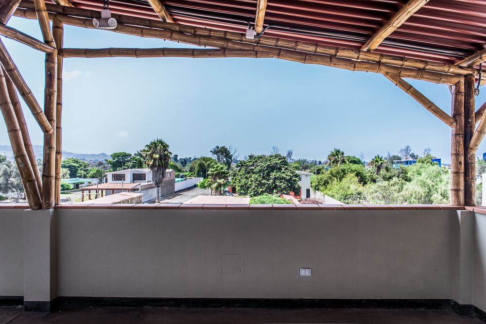
View facing towards the front of the property.
With all that green in the background, it almost looks like a lush and pretty place to live… Don’t be fooled, that’s just because the brown ground is cut out of the picture.
Also, a thrilling outdoor electrical outlet is visible in this picture. And an even more thrilling emergency light. Bonus points if you can spot the electrical box on the wall… it’s painted the same color, so it’s actually not the eyesore that all the rest of my stuff is.
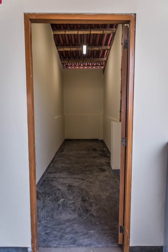
Here’s the table/chair closet. Most exciting closet you’ve ever seen, isn’t it?
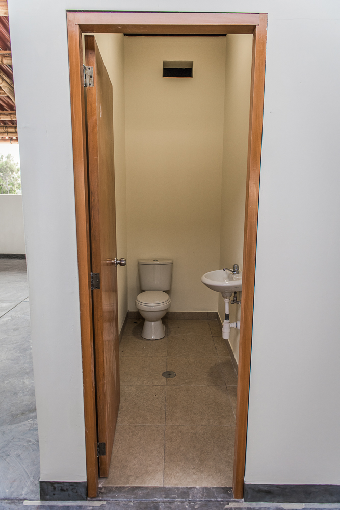
And don’t even get me started on the bathrooms! Can you say “gorgeous”? (hehehe)
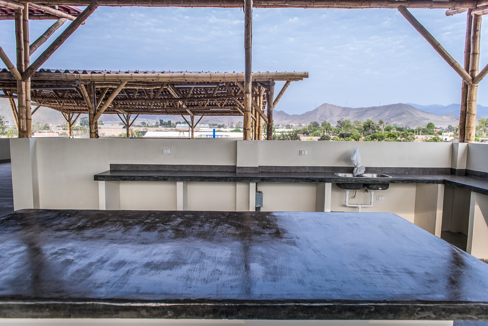
Walking into the kitchen/lab
It looks so nice and neat from this angle…
…and then you look at it from here, and you’re like, “Ew, what is that mess of a box on the right side underneath the counter?” And the answer is, of course, an electrical box. Let’s all just pray that they add cabinets underneath the countertops someday so it’s hidden.
I like how you can see the other part of the roof from here. I just think it looks so cool! (Just telling you one more time, in case that hasn’t come across yet.)

So, there you have it!! What do you think? I know that it can be hard to get a feel for the building when there’s no furniture, so I have one more picture. Jocelyn’s classroom is all set up, and she sent me this after she moved in…
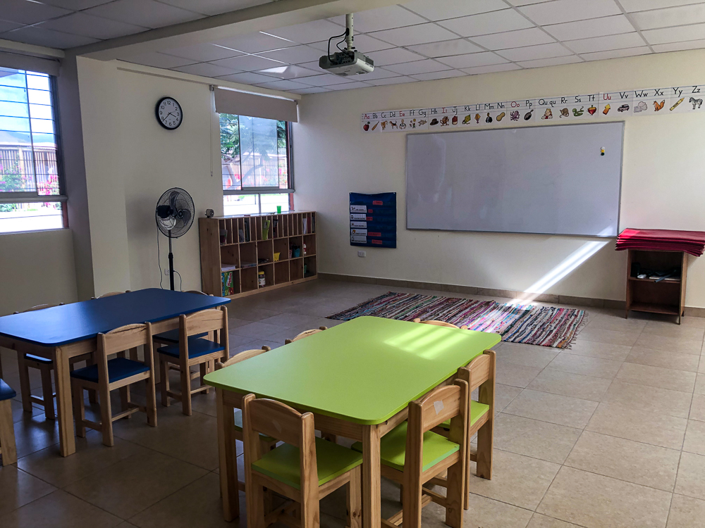
It looks so nice!!! I know you don’t have any concept of how small the old classrooms were, but this one is nearly twice the size. There’s still about a third of the classroom behind where this photo was taken.

I hope you find these pictures as satisfying as I do! It’s been a long year and a long project… we deserve a little satisfaction!

If you think we’re all finished now with blog posts, don’t get ahead of yourself. The building may be finished, but the blog action is just getting started! Next time, we’re off to Canta, a town in Peru that we visited for a long weekend (don’t ask me how long ago we went there… you’ll find out the embarrassing truth soon enough). From there, we’re off to do some more South America exploring! So really, the fun has only just begun.